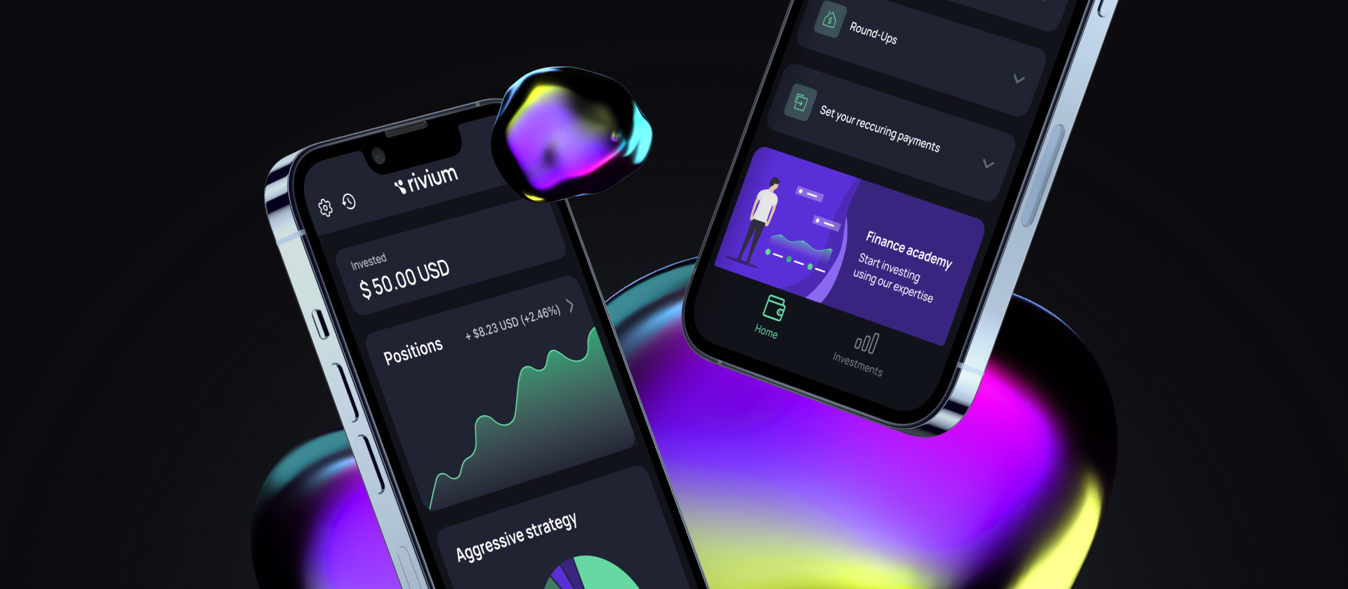
Rivium Mobile App
Rivium helps you set aside small amounts on a regular basis and automatically invest them in exchange-traded funds.
- UX design & Testing
- App design
- App development
- 3rd party integrations
- Web admin panel
- AWS setup
Research
Project analytics was split into two stages:
- — Interviewing the client;
- — Studying the current website and metrics;
- — Selecting survey respondents and interviewing them profoundly;
- — Dialog analysis;
- — Modelling consumer scenarios;
- — Creating an informational architecture.
Once finished, we created functional prototypes of all of the pages. This allowed us to build up a correct concept of the new website and its further development.



First Interaction
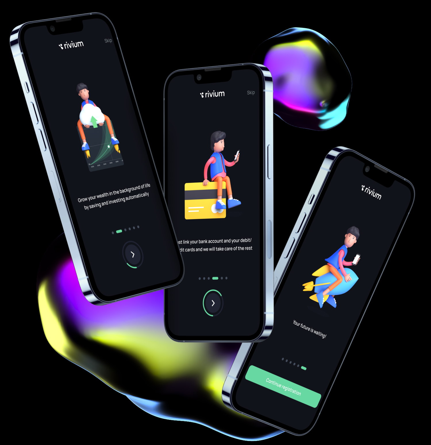
From the very beginning, we immerse users into the gaming industry context by providing a peek into the backstage of a game developer’s profession. We also highlighted the company’s most popular and significant product—the game StandOff 2—in order to emphasize the studio’s scale of operation.
Profile set up
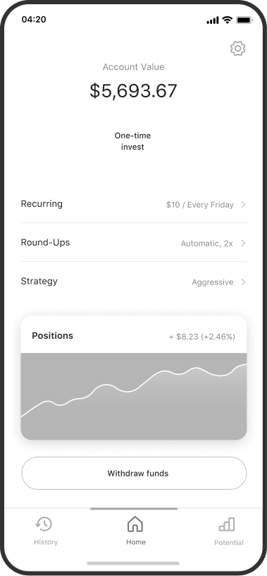
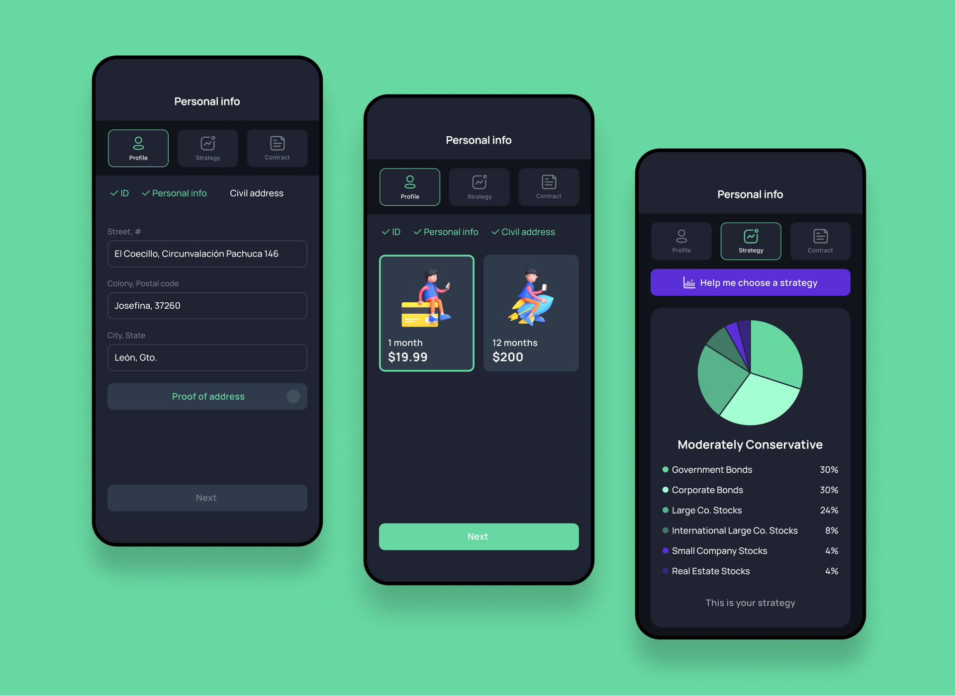
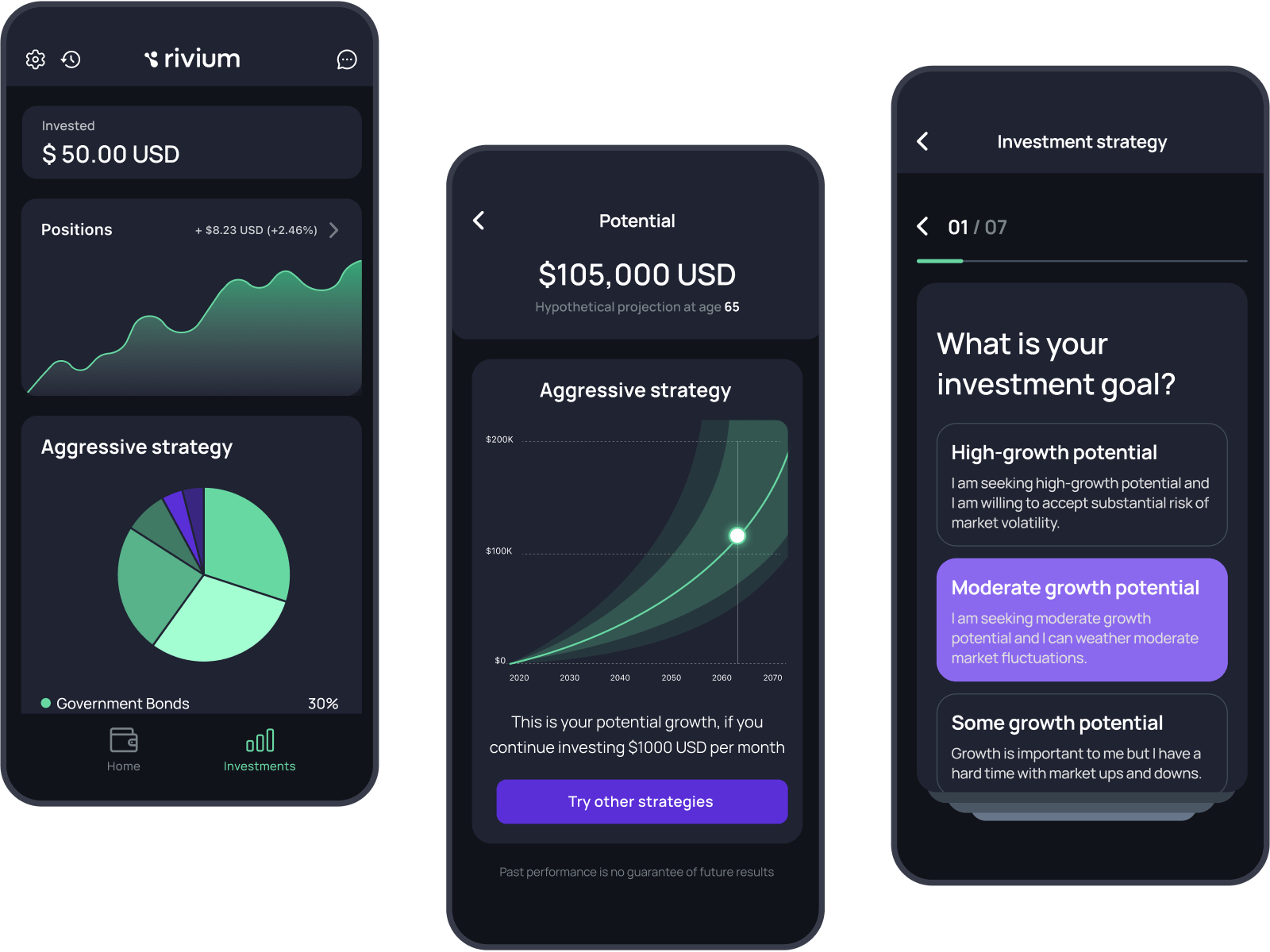
The Home screen contains the most necessary information: total balance, all accounts and cards, bank offers, and frequent actions. Frequent actions make it easy to find the desirable information such as card and account settings, the location of the bank branches and ATMs, and more.
Main Screen
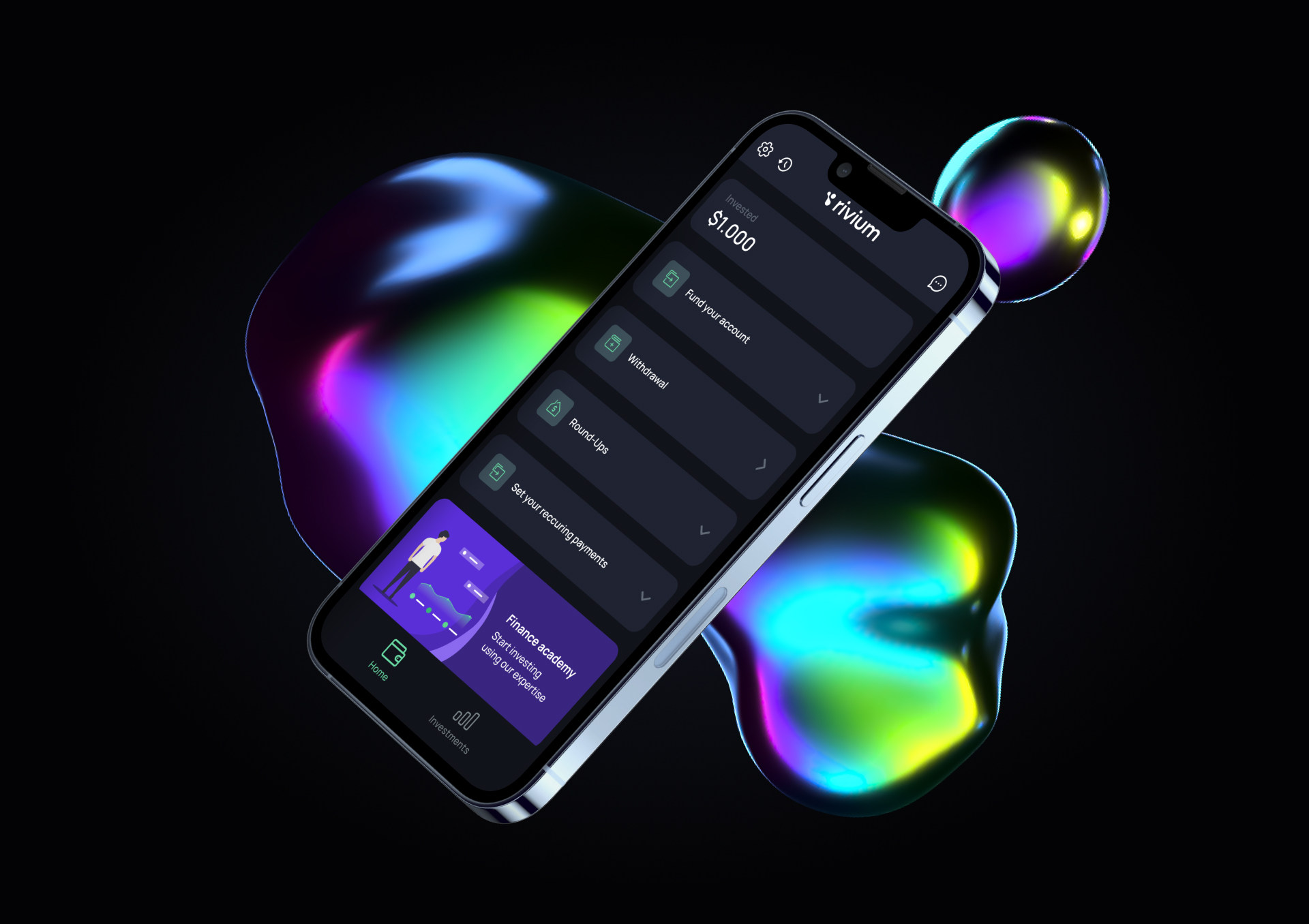
The Home screen contains the most necessary information: total balance, all accounts and cards, bank offers, and frequent actions. Frequent actions make it easy to find the desirable information such as card and account settings, the location of the bank branches and ATMs, and more.
Investments
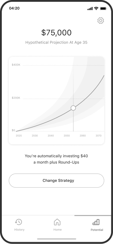
Here, we collected and organized the information about all loaning options. At the bottom of the page, there is a general calculator where anyone can pick suitable conditions.
Finance academy
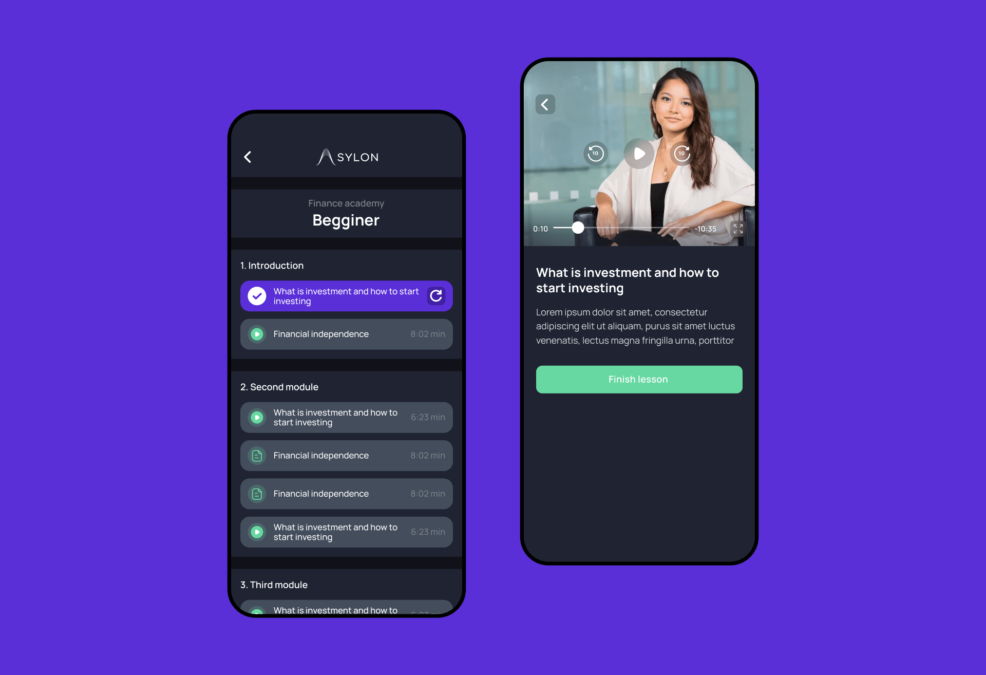
Here, we collected and organized the information about all loaning options. At the bottom of the page, there is a general calculator where anyone can pick suitable conditions.
Other screens
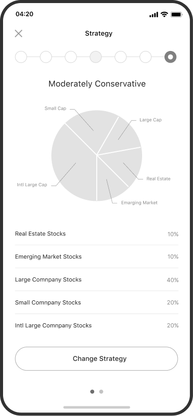
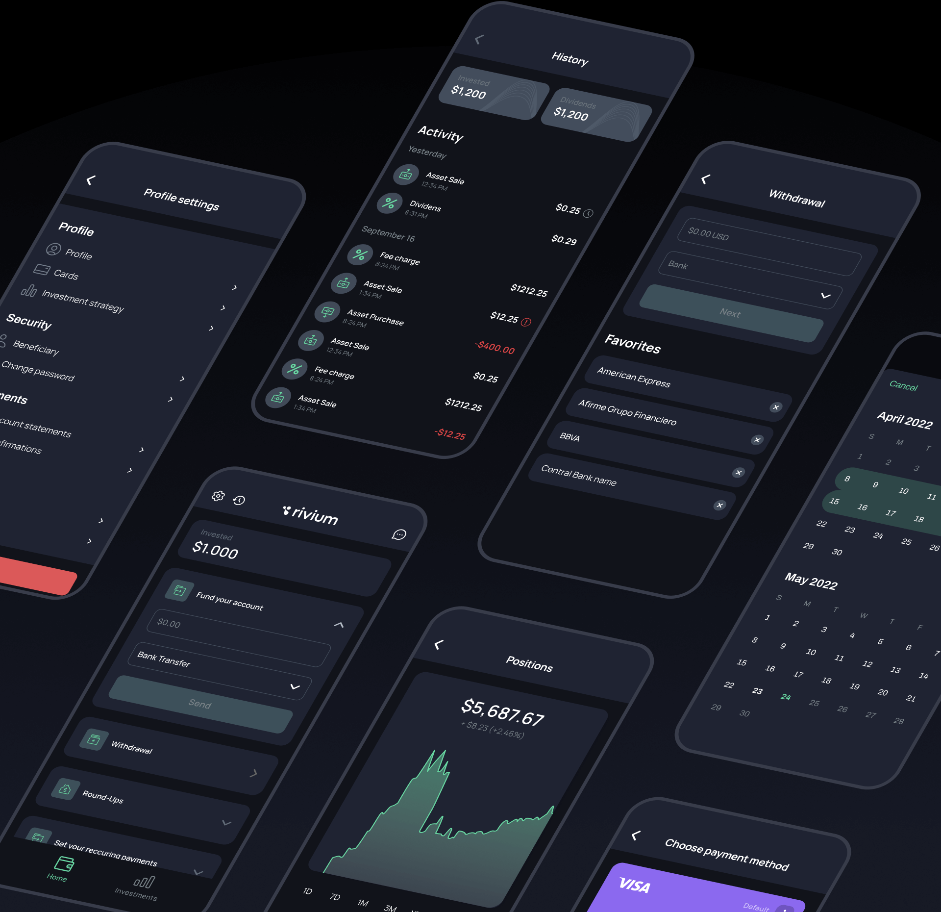
Here, we collected and organized the information about all loaning options. At the bottom of the page, there is a general calculator where anyone can pick suitable conditions.
Backend development
One of our tasks was to work out how to display the design of cards inside the application so that the visualization could be easily read. Now each card has its own unique color. Users can easily track spending and the remaining limit on a specific card.
Key facts and metrics
Project analytics was split into two stages:
- — Interviewing the client;
- — Studying the current website and metrics;
- — Selecting survey respondents and interviewing them profoundly;
- — Dialog analysis;
- — Modelling consumer scenarios;
- — Creating an informational architecture.
